Pretty colors and cool fonts easily grab user attention, but what will convince them to stay on your website? Keeping your site visitors engaged requires you to craft an experience that speaks to your audience, guides them effortlessly, and turns clicks into conversions. This is where visual rhetoric comes into play.
Rhetoric, or the art of persuasion, influences how people think or feel through communication. Visual rhetoric takes it a step further by using design elements to subtly guide user actions without saying a word. Ready to master this powerful tool in your website design? Let’s make your website work smarter, not harder!
Your Simple Guide to Visual Rhetoric
Visual rhetoric uses images, colors, typography, imagery, layout, and other design elements to communicate messages and influence behavior.
It’s amazing how a few design tweaks can tug at our heartstrings—or give us the chills! Colors, for instance, are emotional powerhouses. Warm tones like red, orange, and yellow can create feelings of energy, excitement, or warmth, while cool shades like blue and green often calm us down or inspire trust.
Typography is another sneaky player; a bold, jagged font might scream urgency or danger, while a delicate script whispers elegance and sophistication. Even the layout plays a role!
That’s what rhetoric is all about. Using this tool creates a silent but persuasive conversation with your audience. If you can leverage each design element intentionally, you can evoke emotions, shape perceptions, and guide decisions.
Effective Visual Rhetoric in Website Design
There are four areas of visual communication and structure to master in website design: clarity, consistency, hierarchy, and emotion. Let’s break them down!
- Clarity: Clarity is key in any website design. Keeping your information organized clearly and logically makes it easy for users to find what they need quickly.
- Consistency: Consistency creates a smooth, seamless experience that urges users to continue exploring your site. This includes using the same colors, fonts, and design elements throughout your website.
- Hierarchy: A well-crafted hierarchy guides users through your website with visual cues, highlighting important information and drawing the eye to key areas.
- Emotion: Though we may think of ourselves as logical thinkers, humans are very emotionally motivated. By tapping into the right emotions through design choices, you can evoke your desired response, help your audience resonate with your story, and turn them into loyal customers.
Practical Tips to Improve 5 Key Design Areas
Once you understand the principles of visual communication and rhetoric, it’s time to put them into practice! Here are some actionable tips for each area to help you master this powerful tool in your website design:
1. Color Psychology
Choose colors that align with your specific brand and message.
If you’re a health and wellness company, for example, using calming blues and greens can create a sense of trust and relaxation. Or, if you’re a technology brand, bold and energizing hues like red or orange can convey excitement and innovation. Color psychology is a powerful tool that can make or break your website’s visual structure.
2. Typography
Select fonts that enhance readability and tone.
A friendly, modern sans-serif font might be perfect for a casual lifestyle brand, while a classic serif font may better suit a professional service. Just make sure your chosen fonts are easy to read and consistent throughout so users are tempted to read more.
3. Imagery
Use high-quality visuals that support your narrative.
Whether it’s photographs, illustrations, or icons, ensure each visual aligns with your brand and message. Avoid using stock images as much as possible—they can feel generic or irrelevant. Instead, invest in original visuals that tell your unique story. The emotion and connection they evoke can make all the difference in keeping users on your website.
4. Whitespace and Layout
Create balance and focus.
Use whitespace to create breathing room and lead users’ eyes to important areas, like call-to-action buttons. Also, consider the layout of your website design. Avoid clutter and make sure elements are organized logically to guide users smoothly through their journey to action.
5. Call to Action
Design buttons and links that are visually prominent, clear, and make sense.
Use action-oriented language and make it easy for users to take the desired next step. For example, instead of “Learn More,” use “Sign Up Now” for a more persuasive call to action. You can also use your CTAs to represent your company’s voice and tone, which helps build brand identity.
Mistakes You Don’t Want to Make (And How to Avoid Them!)
Perfecting visual rhetoric takes time and practice, so don’t be too hard on yourself if you make mistakes along the way. Here are some common traps and how to avoid them:
- Design Overload: With so many design elements at your disposal, it’s easy to get carried away. Remember to keep your design clean and focused on your message.
- Inconsistent Branding: Consistency is key, but it’s also one of the biggest challenges. Create a style guide and stick to it!
- Lack of Clarity: If your website design isn’t clear, users will quickly become frustrated and leave. Make sure your information is organized logically and easy to navigate.
- Underwhelming or Overbearing Content: Finding the right balance between too little and too much content can be tricky. Use engaging, high-quality visuals and provide just enough information to pique interest without overwhelming the user.
Visual Projects We Love
It’s hard to talk about visual rhetoric without mentioning some of our favorite projects. Here are a few stunning examples to inspire your next masterpiece!
SunCup Juice
Website: suncupjuice.com

To portray one of the biggest brands in the juice industry, we used vibrant colors and playful illustrations to convey SunCup’s message of kid-sized fun and healthy hydration. Add in some clever copy and clean design, and this website is a perfect example of visual rhetoric in action.
Rising Therapy Collective
Website: risingtherapycollective.com

This modern, calming website is a perfect example of how color psychology can influence emotions and behavior. The soothing earth tones and real company photos create a sense of warmth and trust, inviting users to explore more about mental health services. Not to mention the fun and unique font that adds a touch of personality to the design!
Velocity IT
Website: velocityit.net

Velocity IT’s website perfectly balances expertise and security. The bold use of blues and circuit board graphics creates a cohesive visual identity, while the clean, intuitive layout ensures effortless navigation. We even added dynamic graphics for a modern, forward-thinking touch, reflecting the company’s innovative approach to technology.
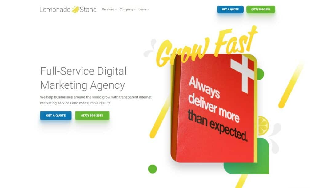
Design a Conversion-Ready Website With Lemonade Stand
Ready to take your website design to the next level? Our team at Lemonade Stand has years of experience creating visually impactful websites that drive conversions. We understand the power of visual rhetoric and can help you craft a website that speaks directly to your audience.
Let’s make your online presence shine—contact us today to turn your website visitors into customers!